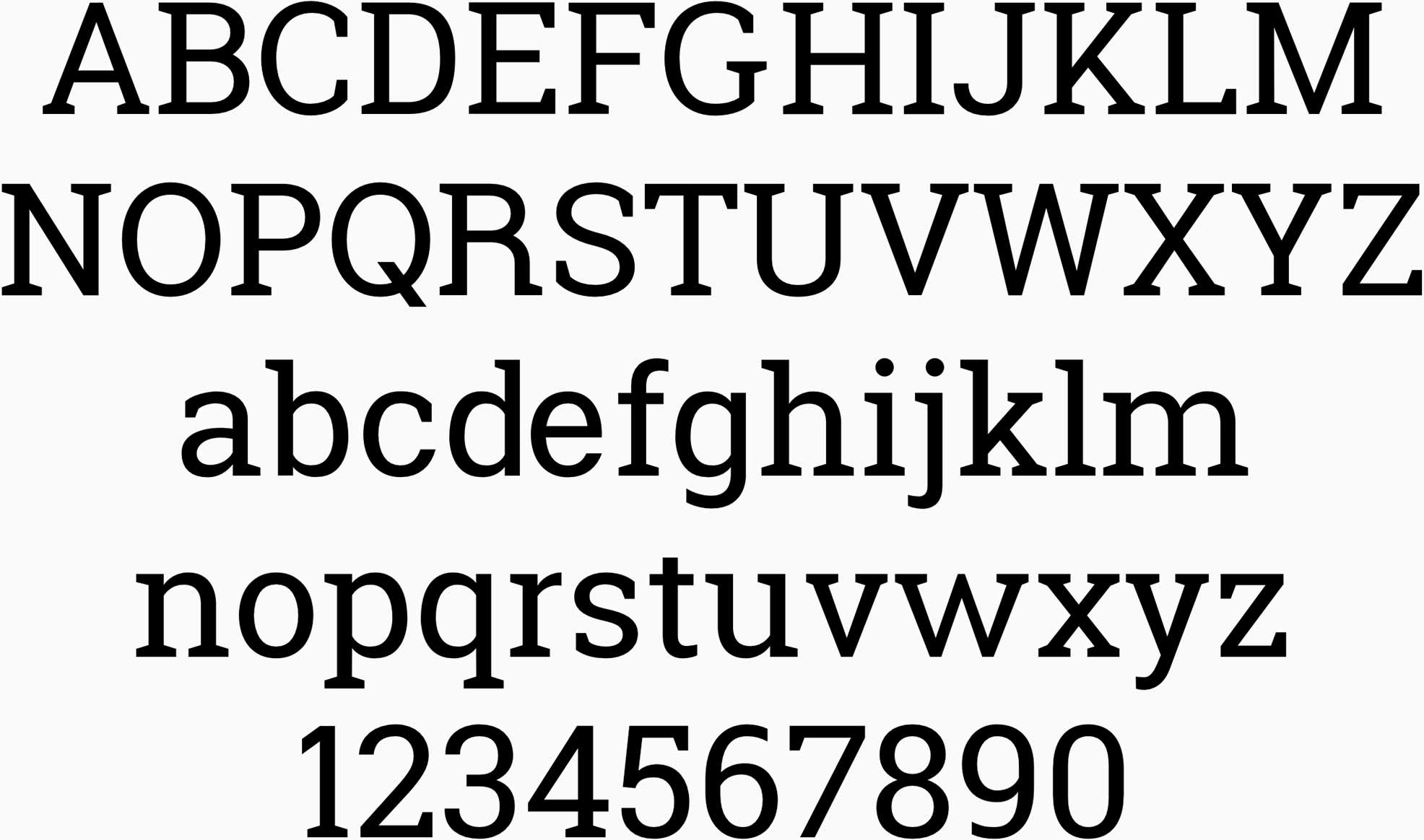
GeoMattric
Type design with a modular, geometric, and friendly approach.
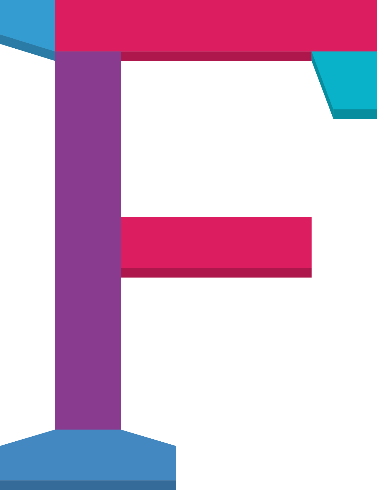
Modular system
Similar to how a child can use a set of building blocks to build varied and complex structures, GeoMattric was created using a modular library of independently designed and reusable type components. This system ensures that each glyph is precisely structured and GeoMattric looks and feels consistent as an entire set.

Geometric forms
GeoMattric has a mechanical skeleton and the forms are largely geometric. Serifs share the same angles. Stems and crossbars are perfectly rectangular. And dots are as round as round can be. These geometric shapes make for a slab-serif typeface that is well-constructed and modern, yet approachable and fun.

Friendly curves
GeoMattric features friendly and open curves. While some grotesques distort their letter forms to force a rigid rhythm, GeoMattric doesn’t compromise, allowing letters to be settled into their natural width and express curves that aren’t con-strained or forced. These slightly wider and rounder shapes make for a more natural reading rhythm and give GeoMattric a greater sense of friendliness, clarity, and optimism.